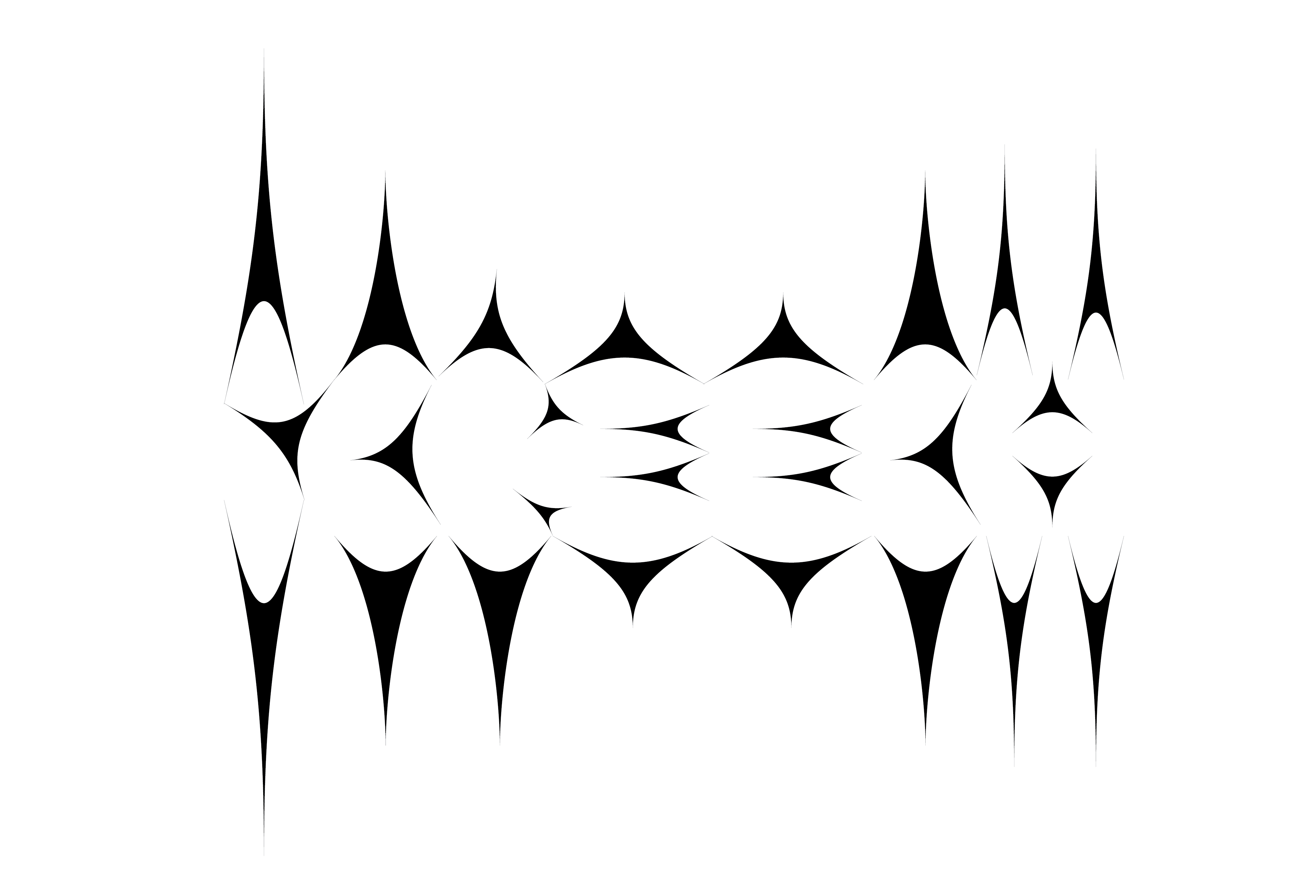
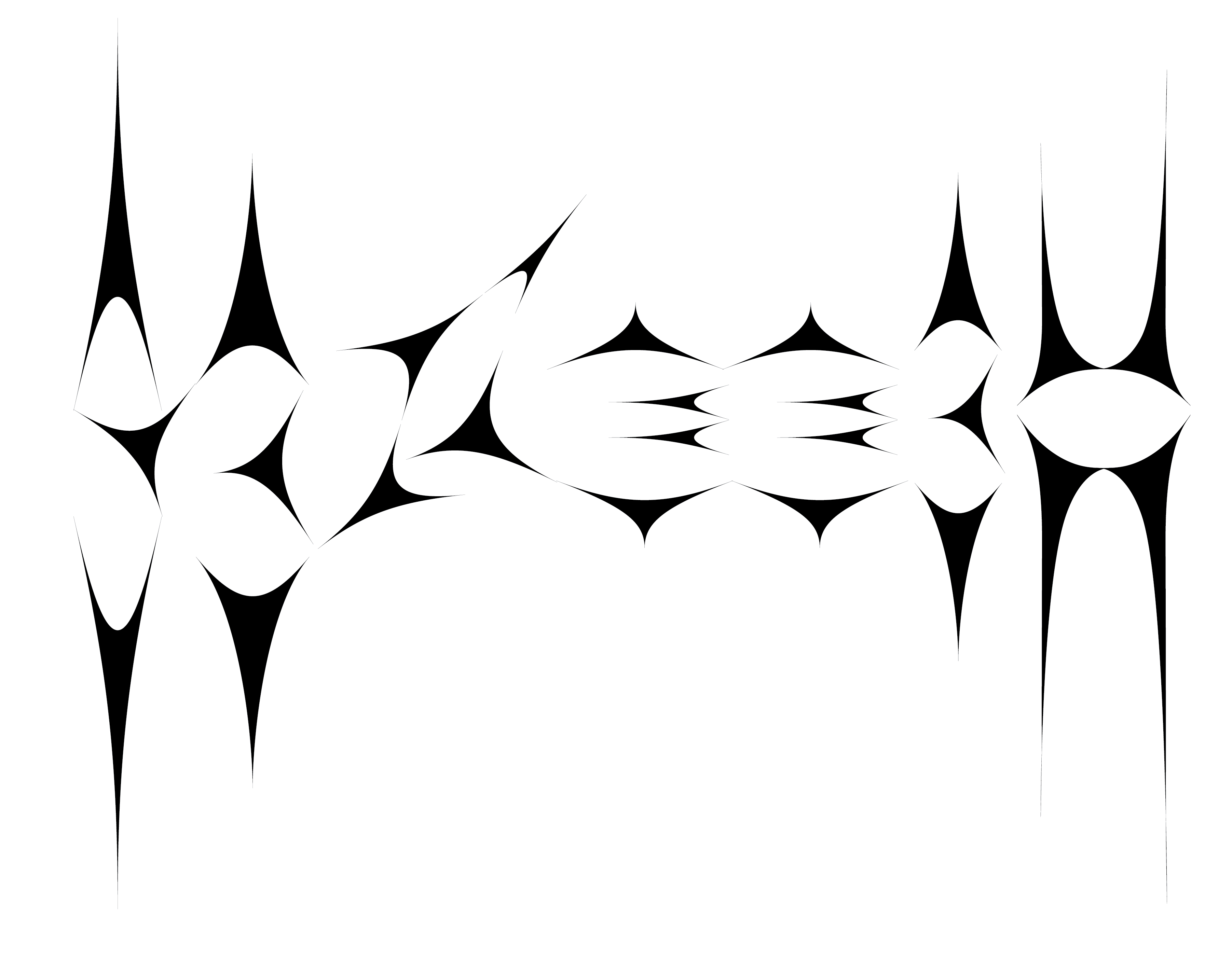
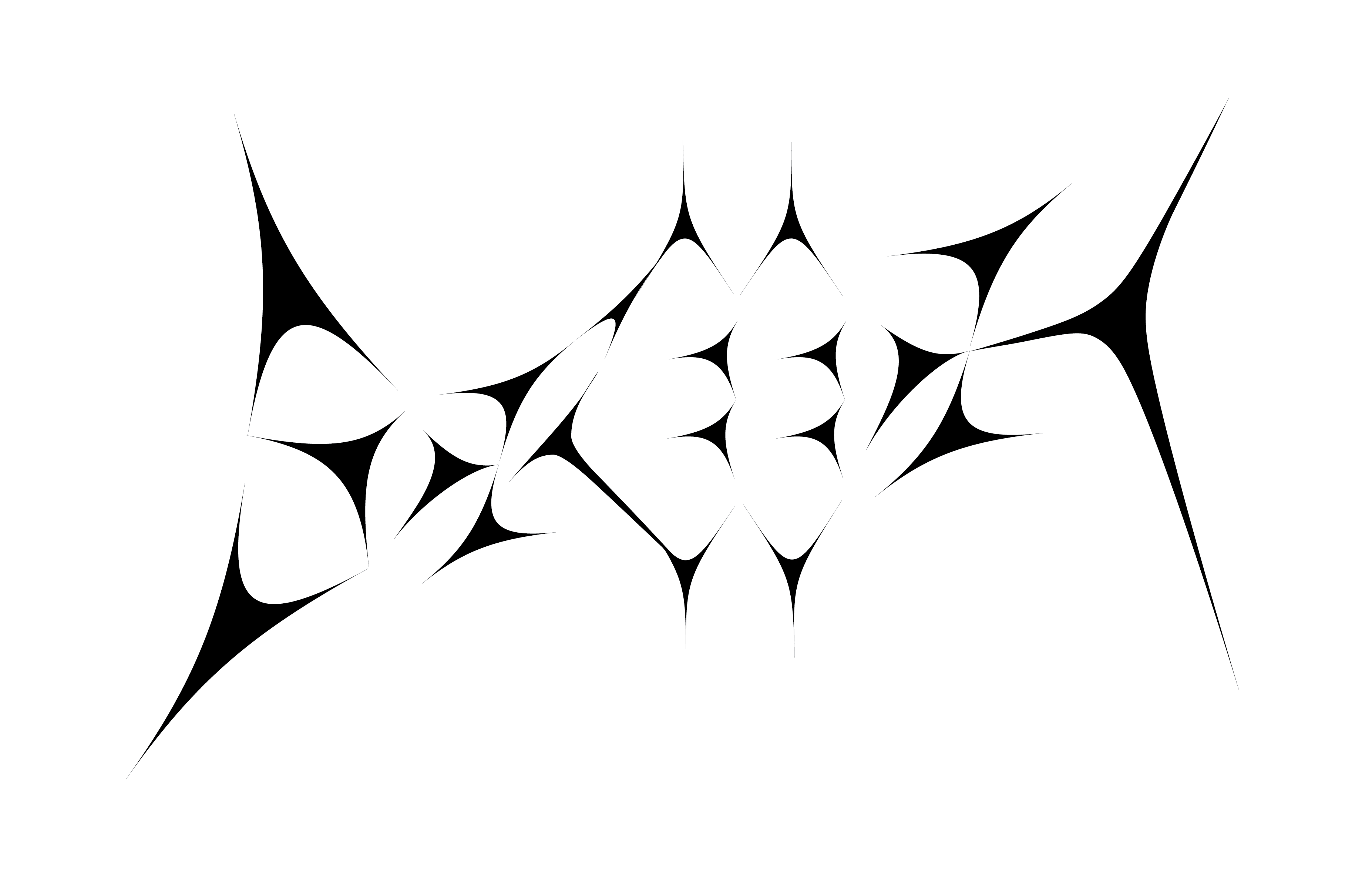
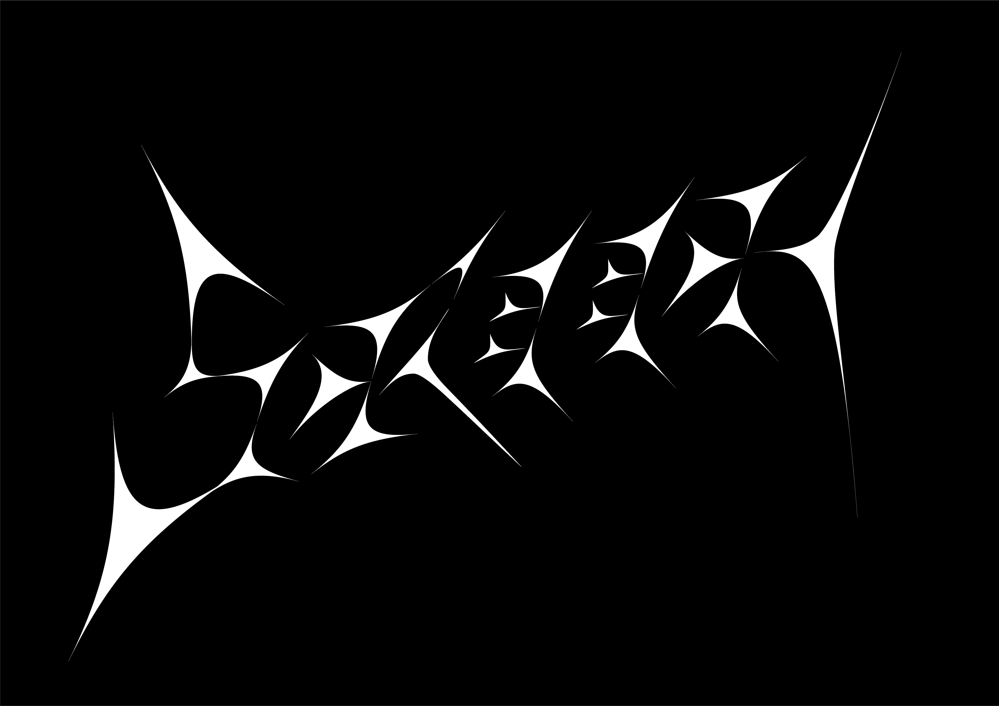
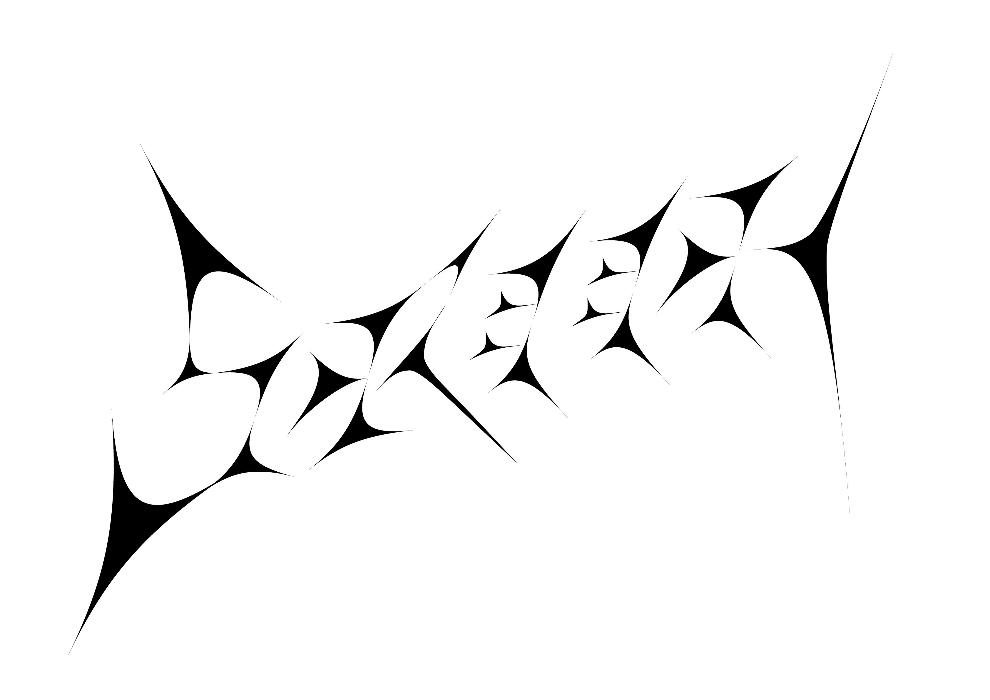
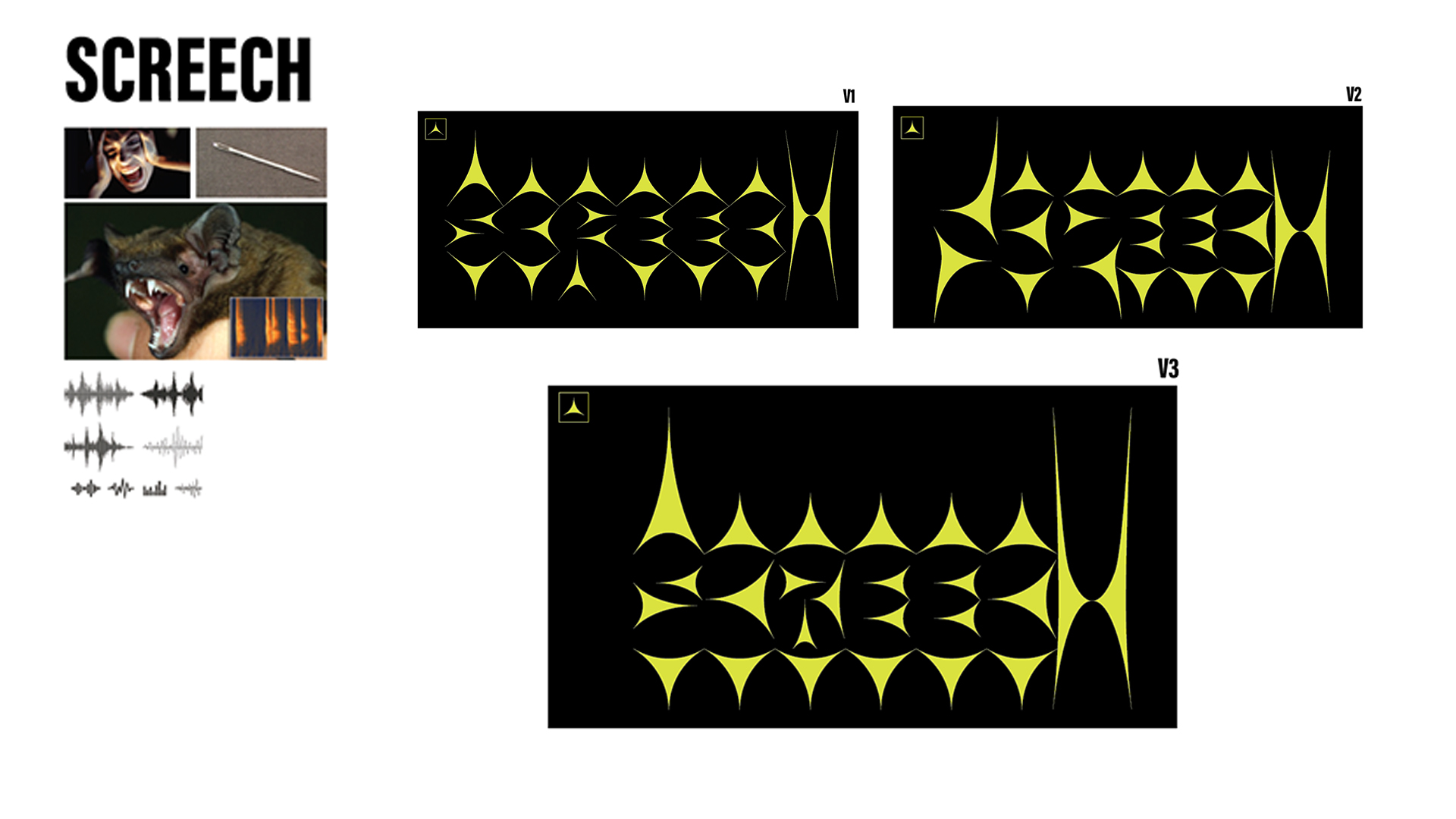
ONOMATOPOEIA DESIGN is a type-focused exploration that visualizes the auditory texture of the word ‘screech.’ The project investigates how typography can embody sound through form, using a carefully constructed balance of negative space and solid fills. The letterforms were designed to feel sharp, strained, and high-pitched—visually echoing the harshness of the sound itself. By treating type not just as text but as a sensory impression, the final design allows the word ‘screech’ to look the way it sounds—jarring, tense, and impactful, yet compositionally coherent.
For this project, I chose to center the design around the onomatopoeic word ‘screech’—a sound that is visually rich and emotionally charged. Its abrasive, high-pitched quality offered a compelling challenge in translating auditory sensation into typographic form. My intention was not only to capture the essence of the sound through form but also to create a versatile typeface with expressive potential beyond this specific context. By focusing on visual tension, sharp contours, and contrasting spatial relationships, I aimed to design a typeface that could be repurposed for titles, motion graphics, or editorial work where intensity and emphasis are key.
Through my own interpretation of screech, I searched up related images and objects that I could think of when the word screech comes up to me. I had a few variations that I was working with. Often times it could be percieve as sharp noise and how these sharp noises can be percieve visually was more evident in a frequency chart. Therefore I tried applying parts of the images that I found
Through collaborative workshops and brainstorming sessions, we generated a wide range of concepts. We evaluated each concept against our design principles and user needs, ultimately selecting the most promising direction for further development.
With each component thoughtfully designed, I began assembling the letterforms by reusing the same modular parts across all characters. I critically evaluated the negative space between letters, experimenting with different spacing adjustments to determine which configuration best enhanced the overall visual impact of the word 'Screech'.
The final design was selected for its visual consistency and cohesive aesthetic. Subtly evoking the forms of cuneiform, it introduced an unexpected historical reference that could have served as a compelling conceptual link to the sound and tone of the word—an idea worth exploring further.