BRANDING & TYPOGRAPHY
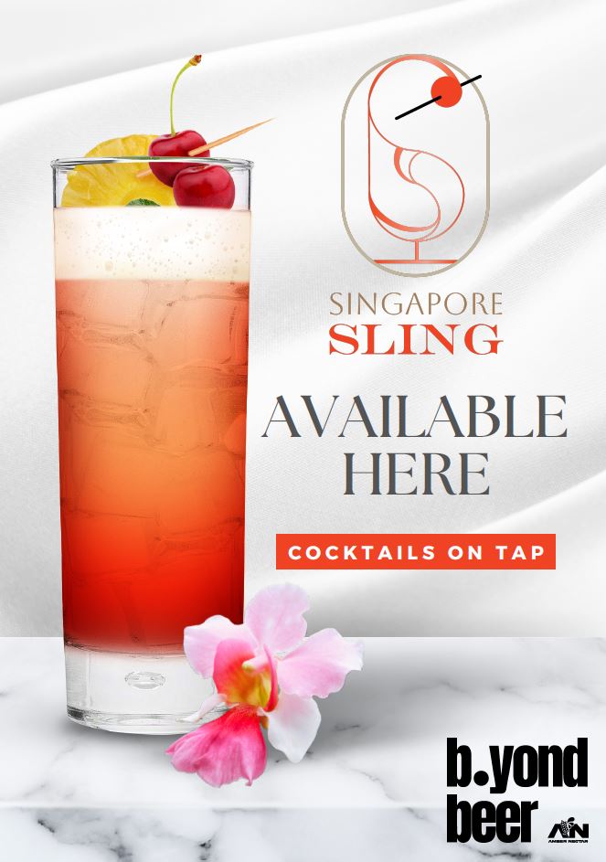
Singapore Sling
A logo design project where it involves a creation of a brand logo for the Singapore Sling drink.
A logo design project where it involves a creation of a brand logo for the Singapore Sling drink.
The Singapore sling is a gin-based sling cocktail from Singapore. This long drink was reputed to have been developed in 1915 by Ngiam Tong Boon, a bartender at the Long Bar in Raffles Hotel, Singapore. It was initially called the gin sling. The pink color, achieved with grenadine and cherry liqueur, made it appear feminine and suitable for women.
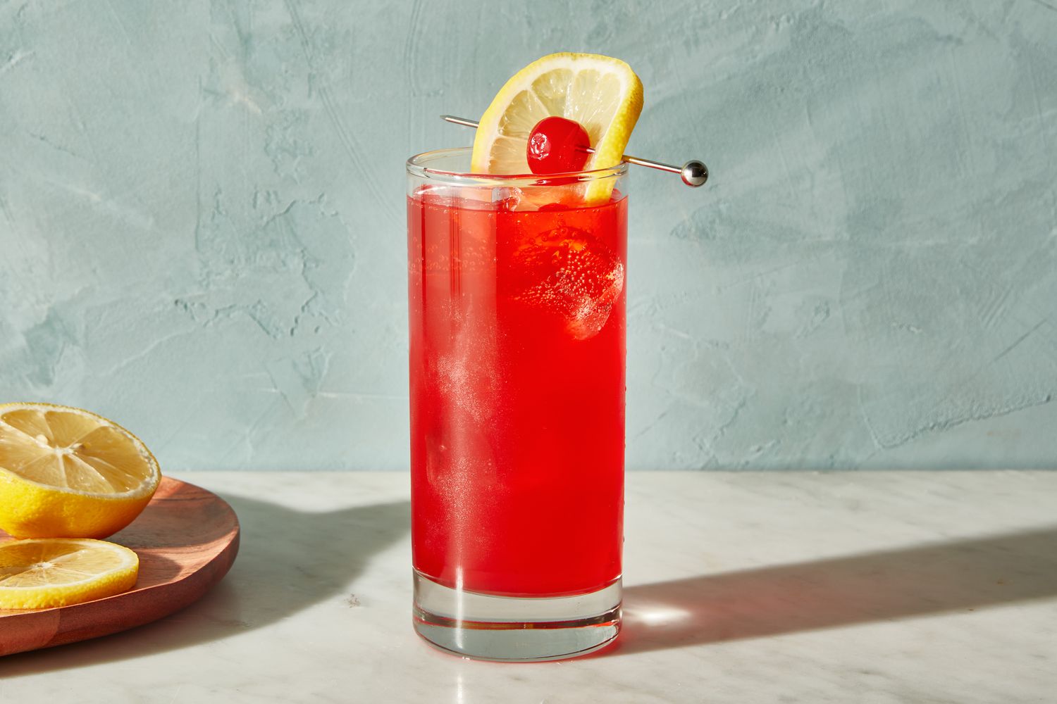
To gain a better understanding of the Singapore Sling, research was conducted on its history and common representations. The drink, with its feminine color, was originally crafted for women to enjoy discreetly in public during the past.
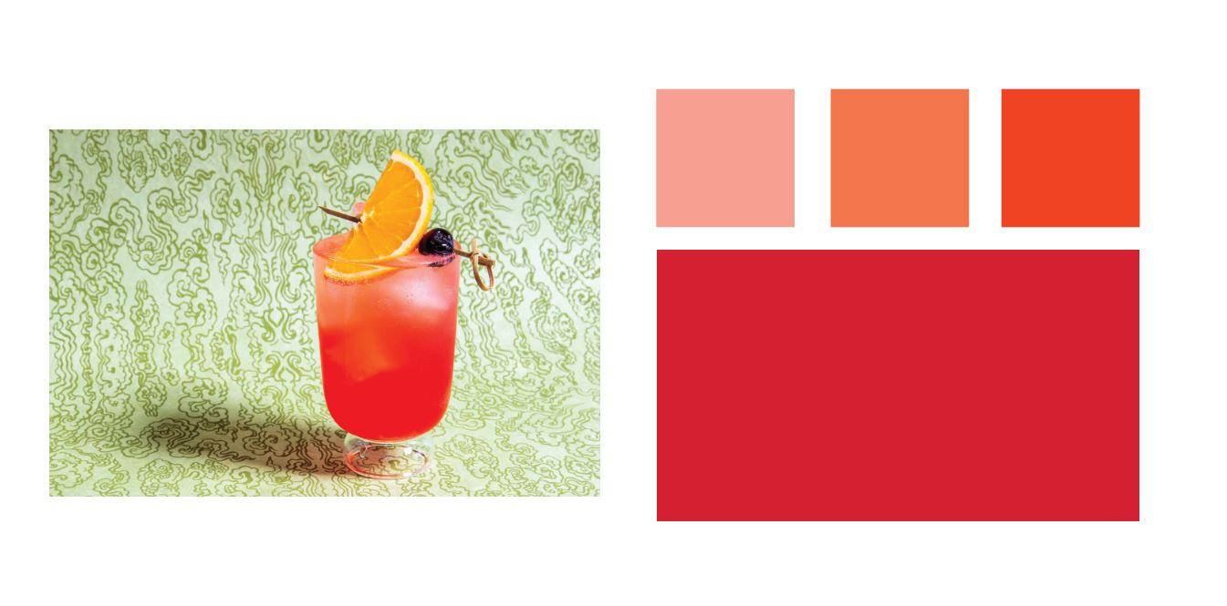
Hence, the colors that was picked for the logo was a combination of orange red and salmon pink that closely resemble the drink itself.
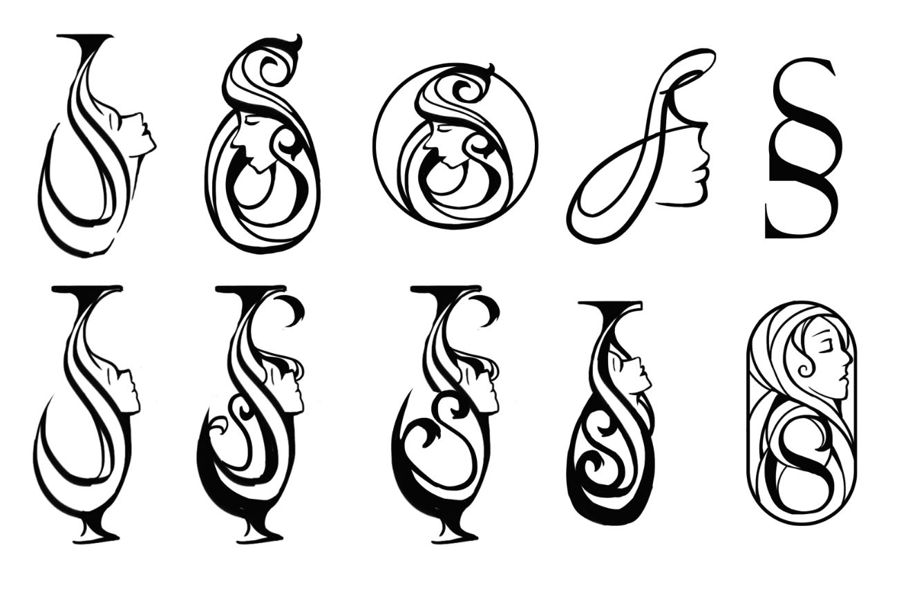
The initial drafts involve the two initials of the drink's name. With the two letter 's', I came up with a few variations that tries integrate a glass wine vase shape and a female element to it.
However, the design was not as cohesive as I had hoped for and it was too much like a beauty saloon shop rather than a drink that communicates to the audience.
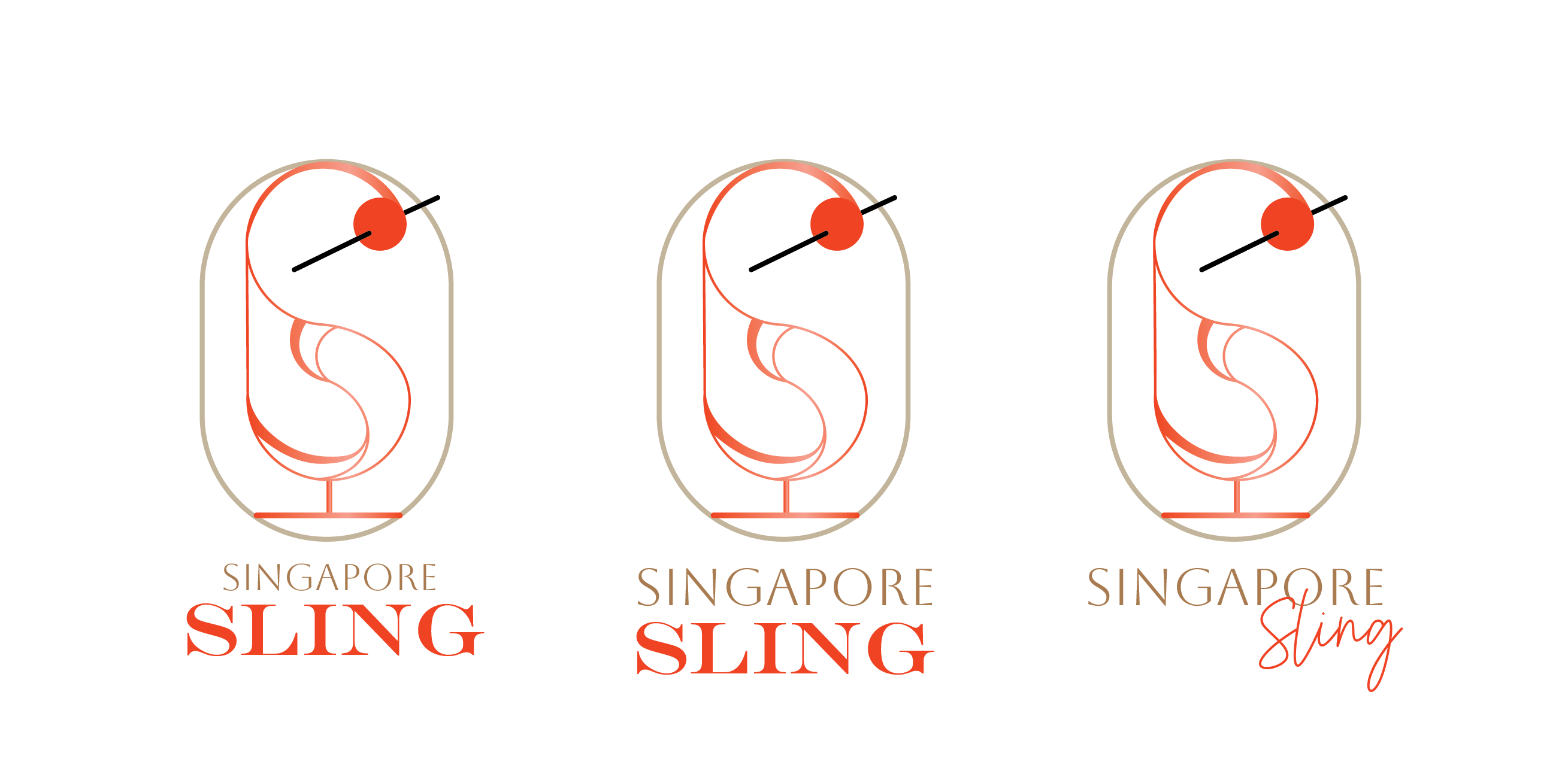
After considerable deliberation, the design direction shifted towards a more minimalist style, aiming to appeal to both genders while retaining a subtle hint of femininity.
The core concept continues to draw inspiration from the silhouette of a wine glass, while integrating visual cues from the drink itself and exploring typographic play. Through the strategic use of two letters, a clever juxtaposition is formed to resemble a wine glass, with the color palette thoughtfully selected to introduce a subtle touch of femininity to the overall design.
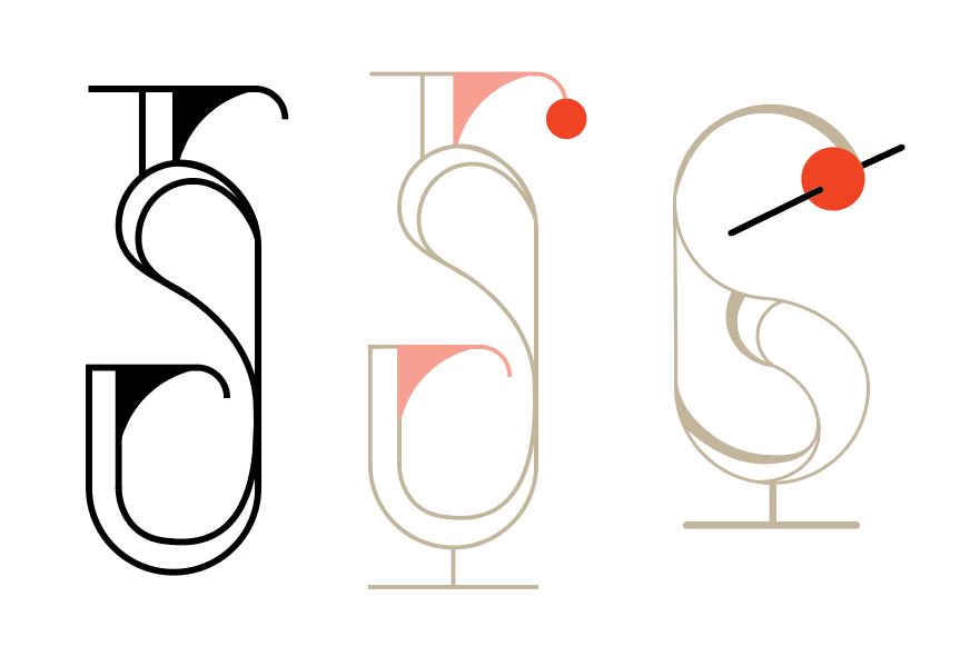
The final design selected was one that closely resembled a glass with a cherry garnish. Its slightly shorter and wider proportions give it a more approachable and visually balanced appearance.
The chosen typeface was designed to reflect the elegance of the drink while maintaining balanced weights to ensure a gender-neutral appeal for the audience.