BRANDING & TYPOGRAPHY
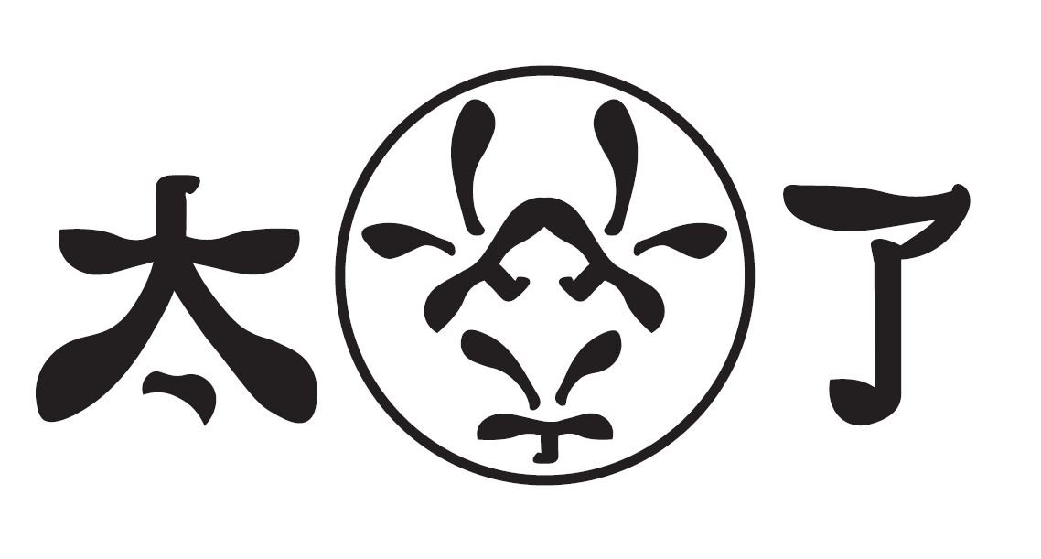
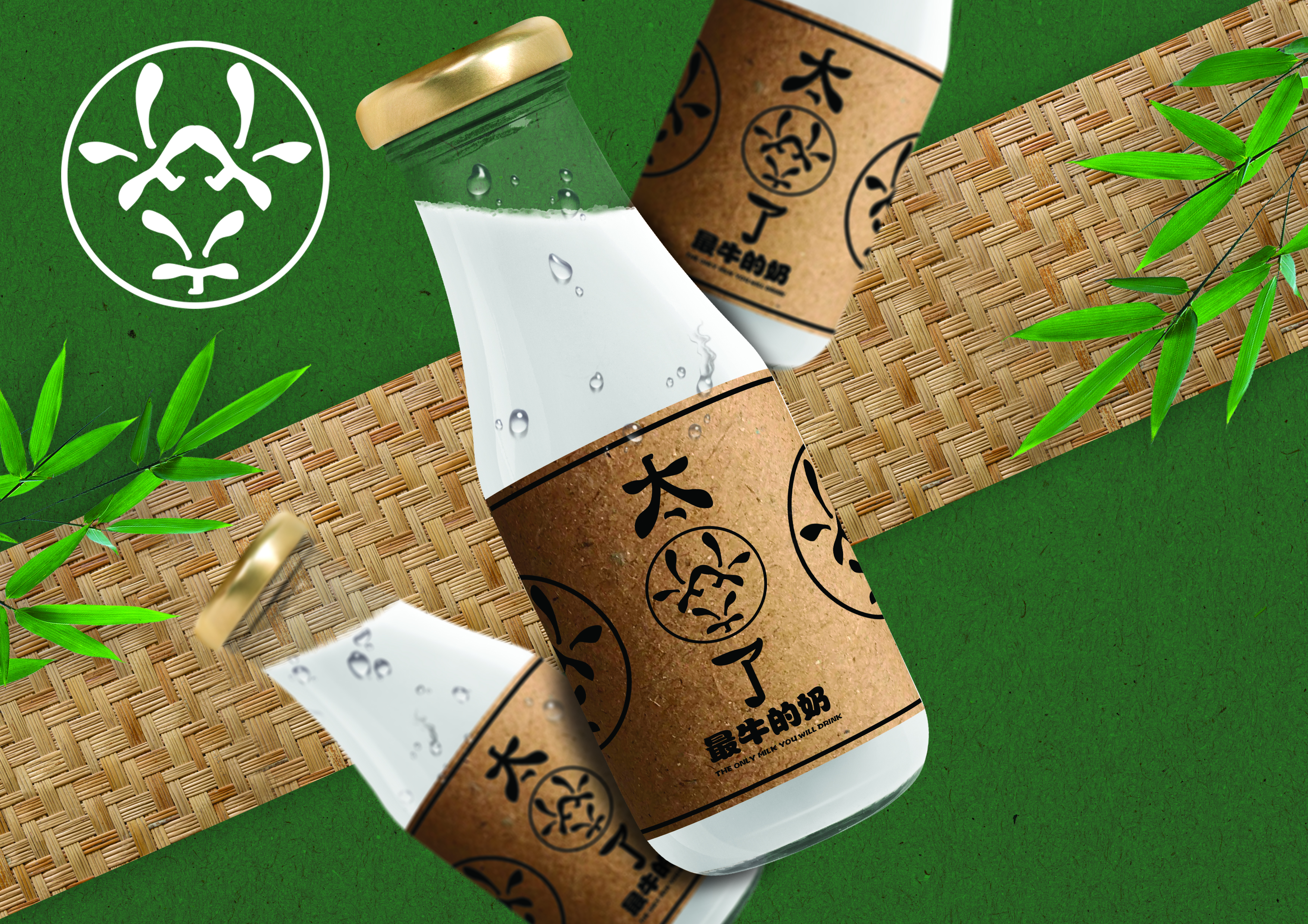
太牛了
A branding project that explores the use of Chinese internet slang, examining how this cultural element can influence type design and inspire a unique brand identity.
A branding project that explores the use of Chinese internet slang, examining how this cultural element can influence type design and inspire a unique brand identity.
Due to the Chinese government’s oppressive internet censorship, everything Chinese citizens see is restricted and controlled. Some of these online slangs came to surface and it is interesting to see how it can be incorporated into typeface design while retaining the context of these slangs.
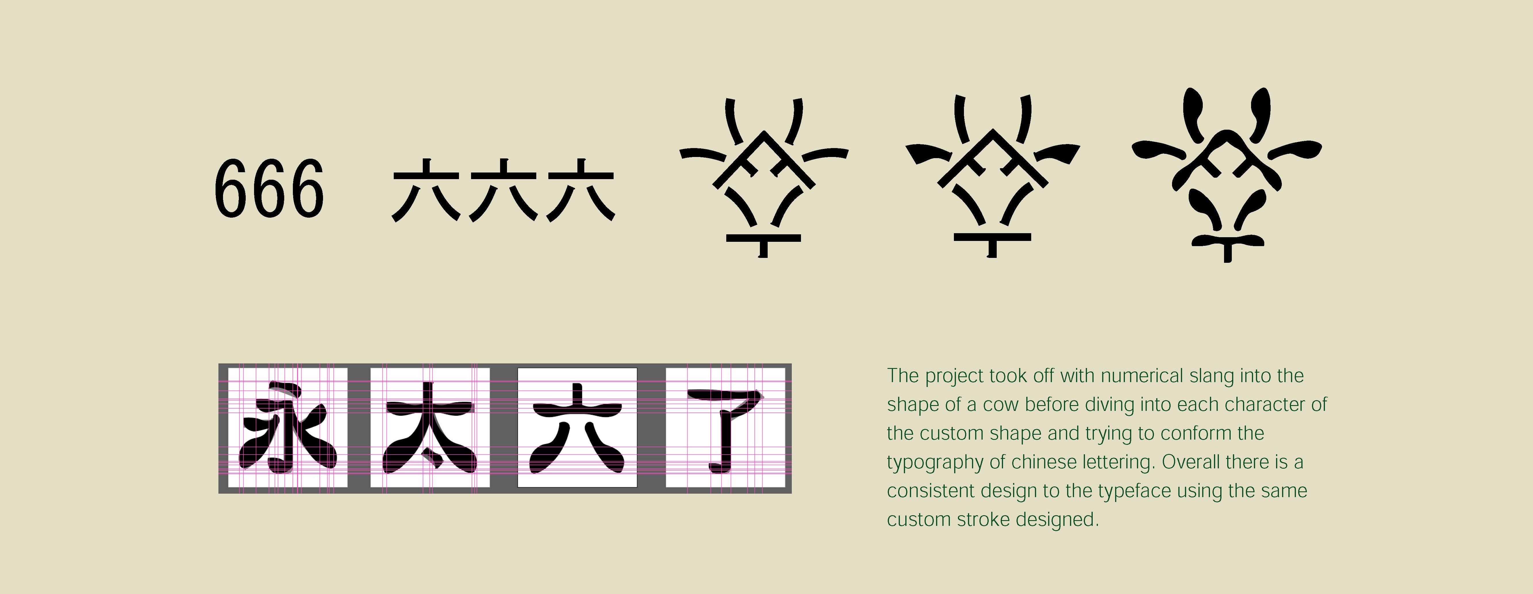
With the 666 as the commonly used slang in China, I decided to try if I could use the chinese letters instead of numerical form to come up with something. WIth a few attempts, I thought of making the 666 resemble the cow which derived from the word “牛”. I tried to use a bit of literal and semantic translation in the design.
Strokes are the most elemental building block of Chinese characters. The character yong (永) is used to illustrate the eight types of basic strokes in Chinese calligraphy
After researching a bit more on the Chinese lettering, I decided to go with a different approach as it would require a lot of study and trials on the different strokes and how it works for each Chinese letter.
From both linguistic and visual points of view, Hanzi and Latin are at the polar opposites of the spectrum. While the Latin alphabet is made up of 26 letters in lower- and uppercase with simple, somewhat modular strokes and shapes, Hanzi is an open system consisting of tens of thousands of characters which are much more complex in form and construction. Hanzi characters do not have obvious alignment references such as baseline, x-height or cap-height as in the Latin script. In some cases, words are often reused in other letters and this will affect the strokes which makes each word different from one another.
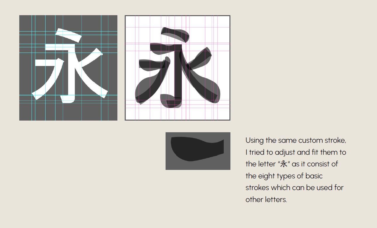
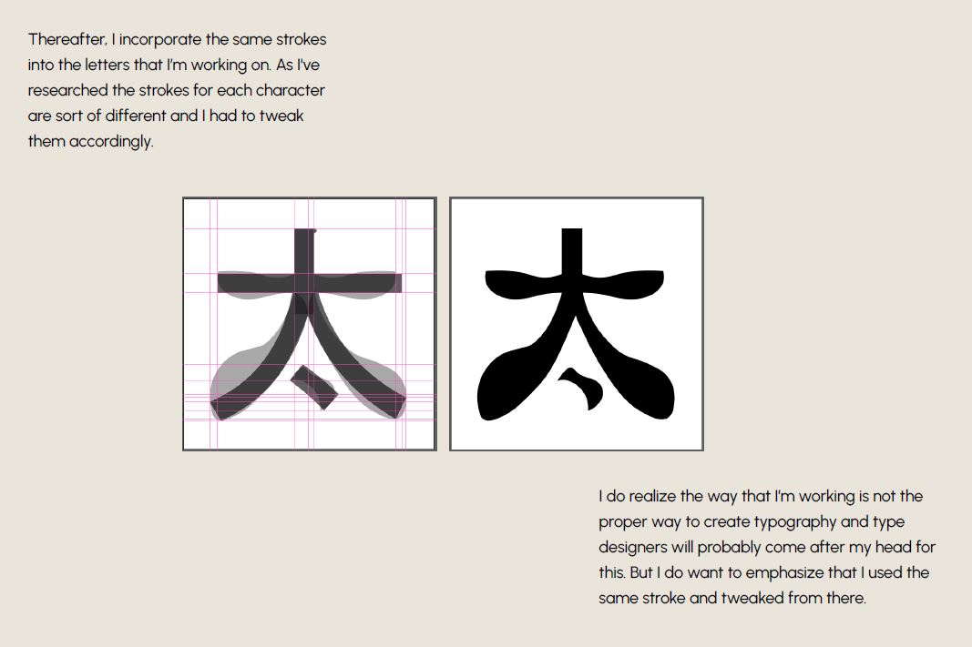
Thereafter, the same strokes are incorporated into the letters being developed. Research revealed that the strokes for each character vary, requiring adjustments to be made accordingly.
I do realize the way that I’m working is not the proper way to create typography and type designers will probably come after my head for this. But I do want to emphasize that I used the same stroke and tweaked from there.
As a slang term used to praise something as great, the word presented an opportunity for a playful wordplay concept. This led to the creation of a brand that is both literal in referencing the product—milk—and distinctive in its approach. The design playfully conveys how the product stands out, with the context behind the construction of the typeface adding further depth.